

King of KingsBrand strategy. Logo identity development. Apparel design. E-commerce website design.
A purpose-driven apparel brand, built from the ground up.
King of Kings was created to challenge conventional faith-based apparel by bringing together contemporary design, meaningful symbolism, and a mission to inspire conversations. From brand strategy and identity to product design and digital commerce, the venture was developed as a cohesive experience where every detail serves a larger purpose.
The challenge
Rethinking faith-based apparel.
Traditional Christian apparel often relies on overt religious messaging, familiar graphics, and designs that prioritize the message over the aesthetic.
King of Kings began with a different question: what if faith-inspired clothing could be something people genuinely wanted to wear because of its design?
The opportunity was to create contemporary, timeless apparel that expressed faith through understated messaging and thoughtful design.
Rather than communicating everything immediately, the brand would invite curiosity and create opportunities for conversation.
“Designed to be worn. Created to start conversations.”
The approach
Lead with design. Create curiosity. Inspire conversation.
King of Kings was built around a straightforward idea: great design can create opportunities for meaningful human connection. The strategy established three guiding principles.
01
Design first
Create contemporary, timeless apparel that people choose to wear for its visual appeal.
02
Meaningful by design
Embed biblical meaning and intentional symbolism into the identity, messaging, and products.
03
Curiosity creates conversation
Use subtle messages, unexpected typography, and thoughtful placement to encourage questions and engagement.
The identity
More than a crown.
At the center of King of Kings is a distinctive crown symbol designed to express the brand's Christian foundation through thoughtful visual symbolism. The identity brings together two meaningful ideas: God is infinite, and the Trinity.
01
Infinity
An overlapping infinity form represents God's infinite nature, with diagonal cuts that echo the crown identity.
02
Father, Son & Holy Spirit
Three points represent the Trinity, expressing the unity of Father, Son, and Holy Spirit.

03
One unified identity
Together, these ideas form a distinctive crown representing Jesus Christ, the King of Kings.
The first two stages are conceptual illustrations of the symbolism behind the identity — not technical construction drawings.
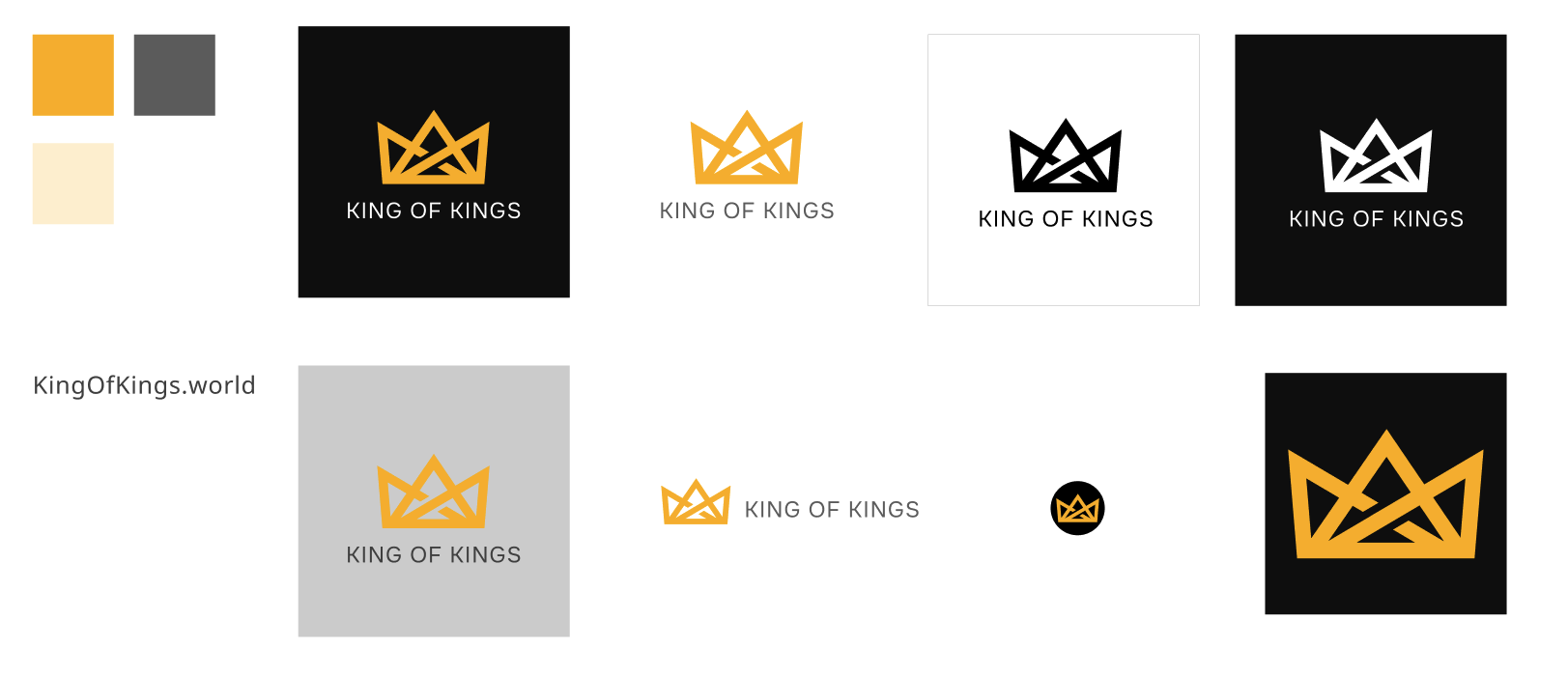
Final logo identity system
One identity, built for every application: a defined color palette, gold, black and white logo variants, stacked and horizontal layouts, and a standalone crown.
Design exploration
From concept to collection.
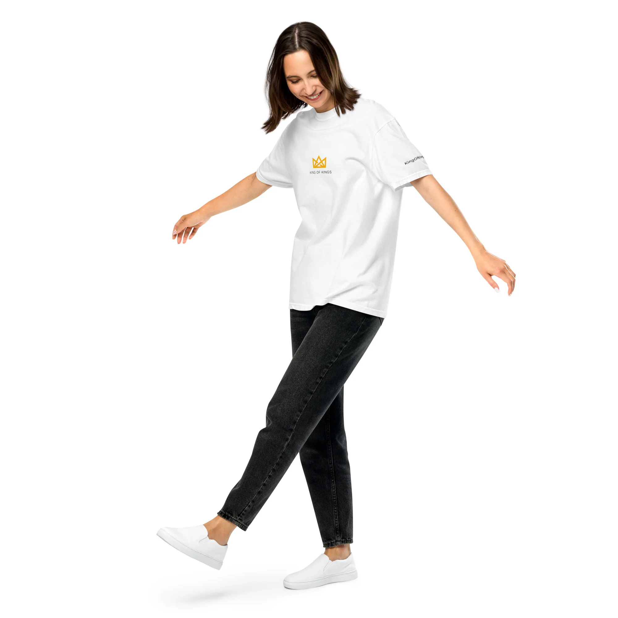
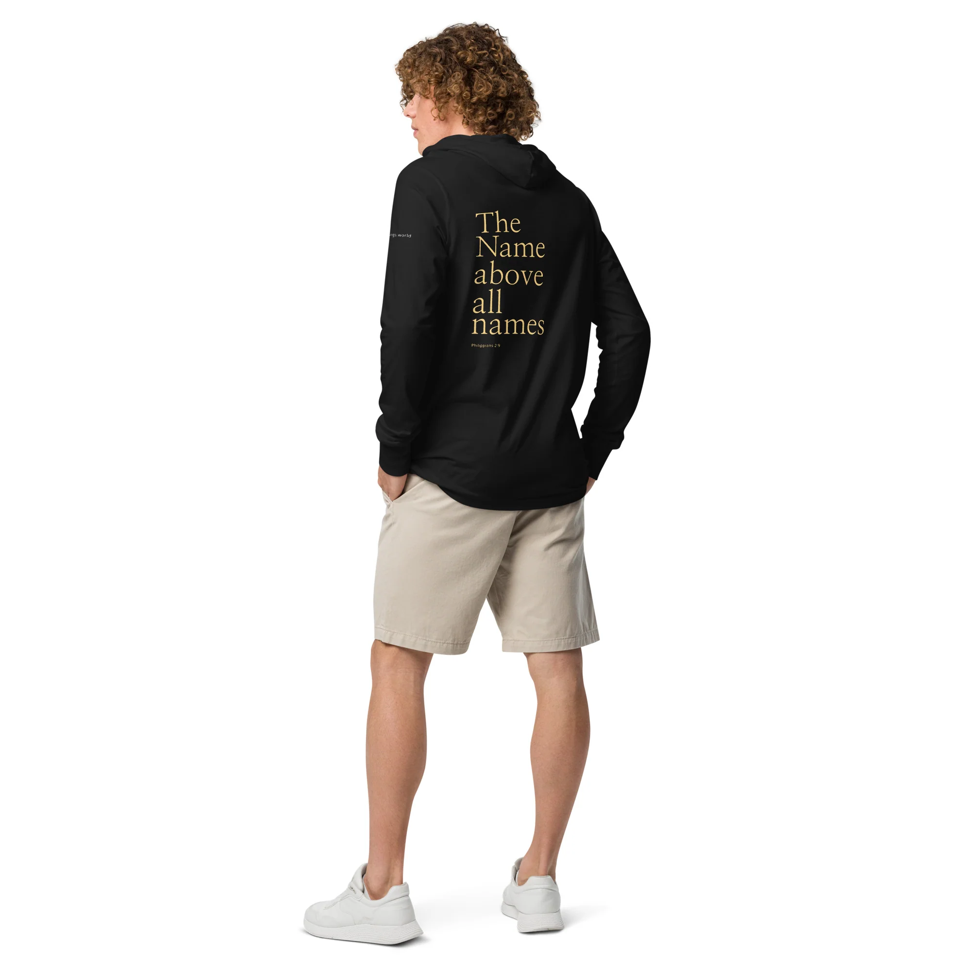
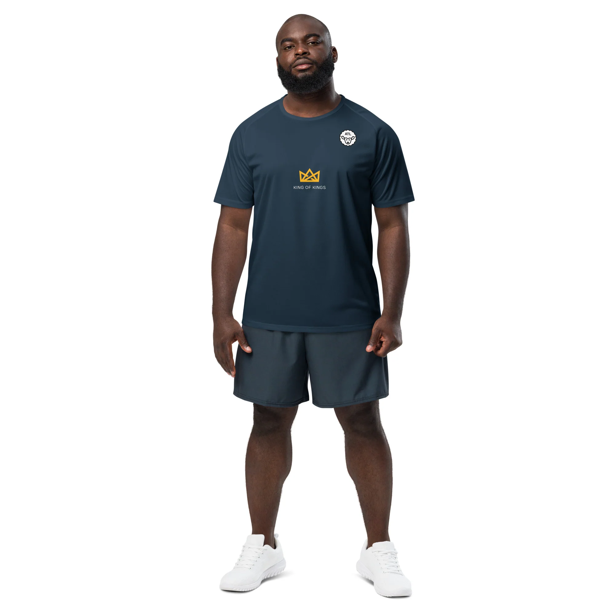
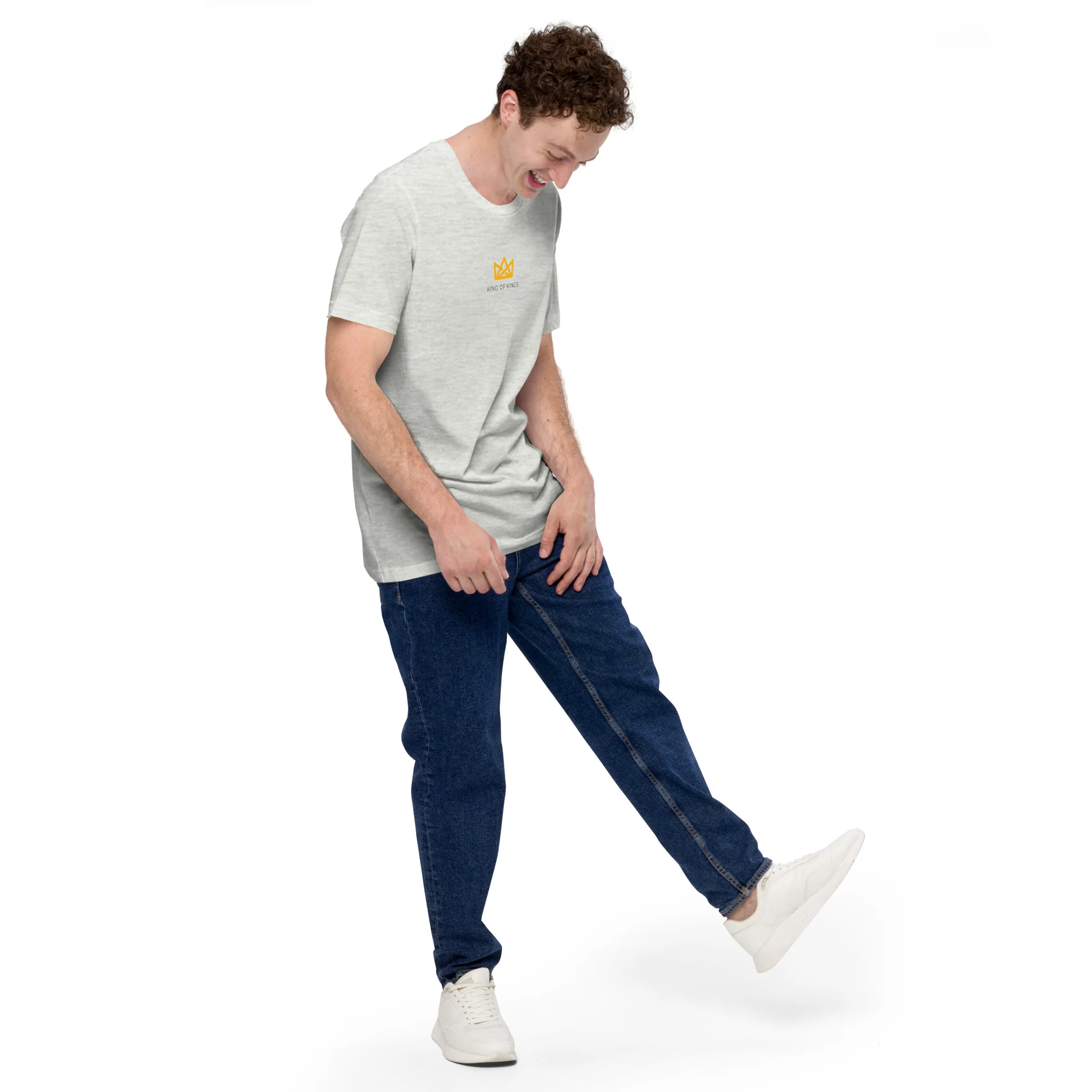
With the brand foundation established, the identity evolved into a coordinated apparel collection. The process explored typography, scale, placement, messaging, and composition — building a recognizable design language rather than isolated graphics.
Concept exploration — work in progress
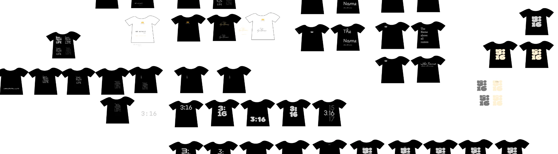
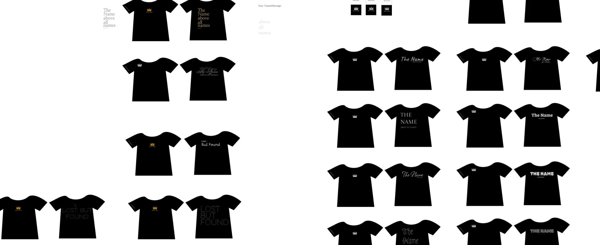
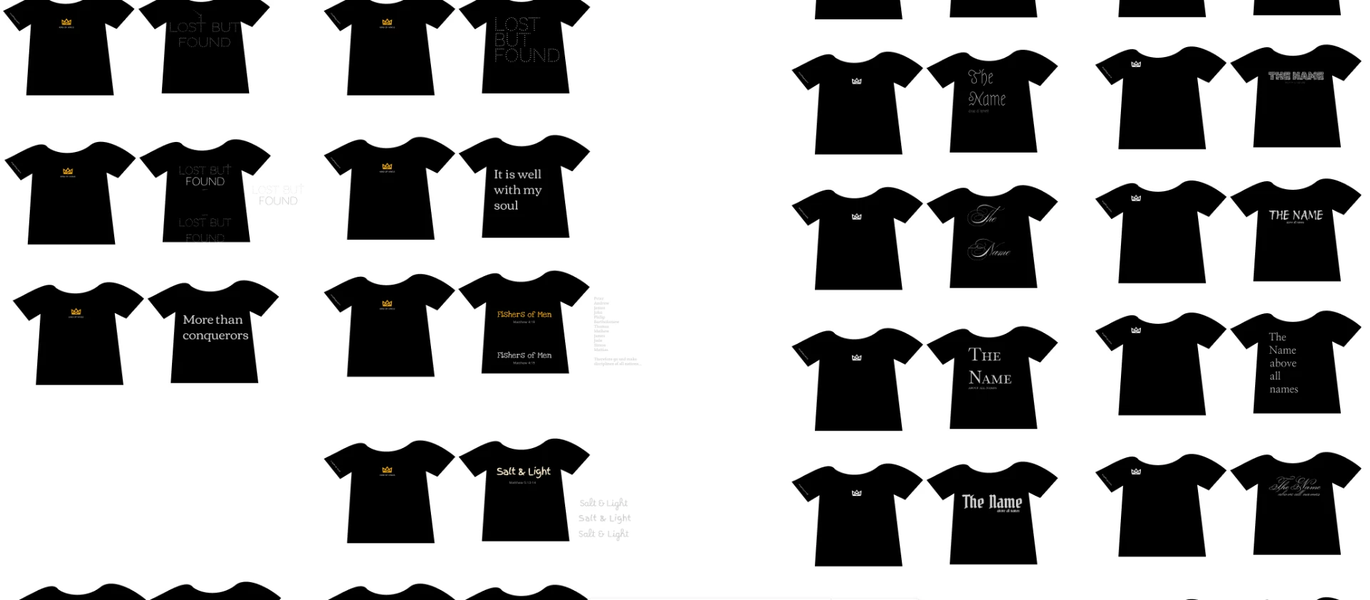
Original design explorations — not every concept reached production.
Finished product
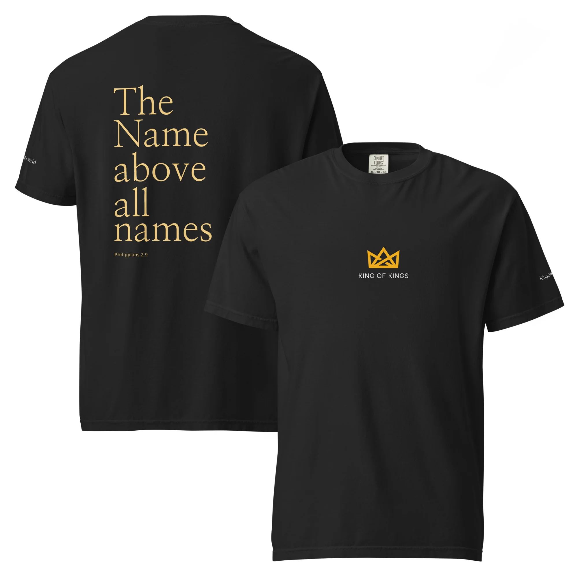
The experience
Purpose made tangible.
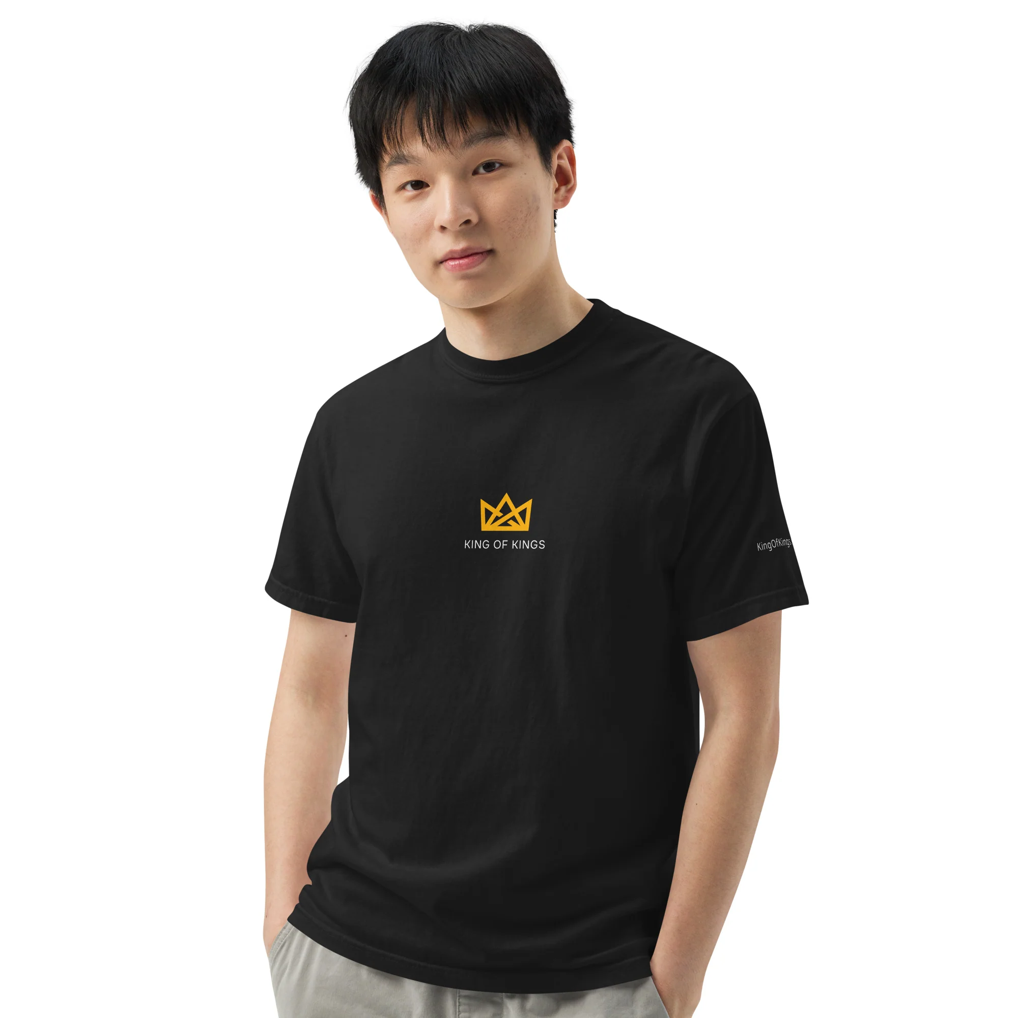
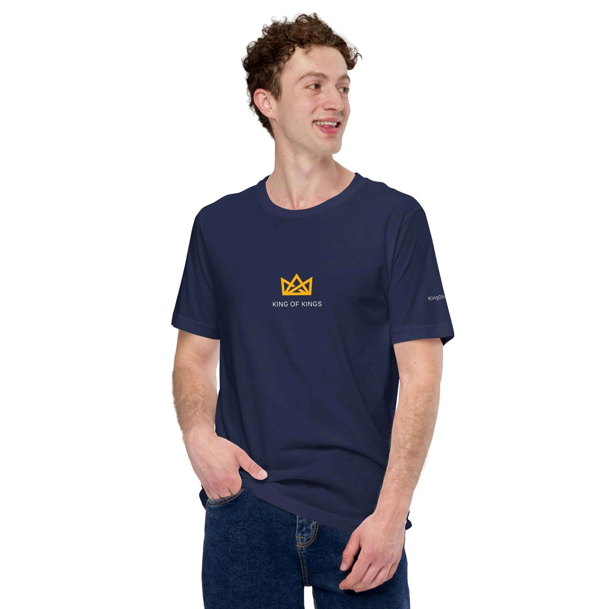
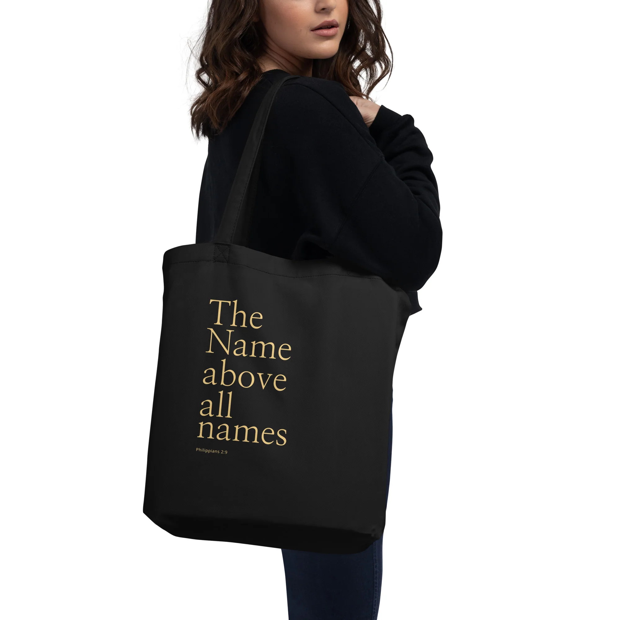
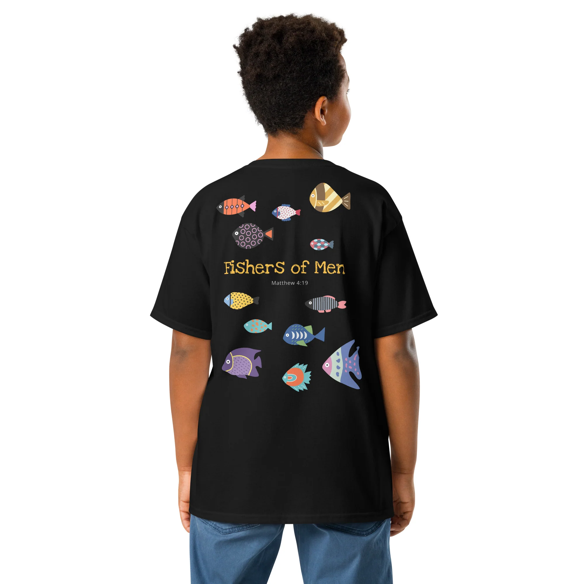
The King of Kings visual language extends across apparel and everyday products, creating a consistent experience rooted in timeless design and meaningful messaging. Each application balances understated branding with purposeful typography and biblical references.
Product innovation
Designed to be seen in motion.
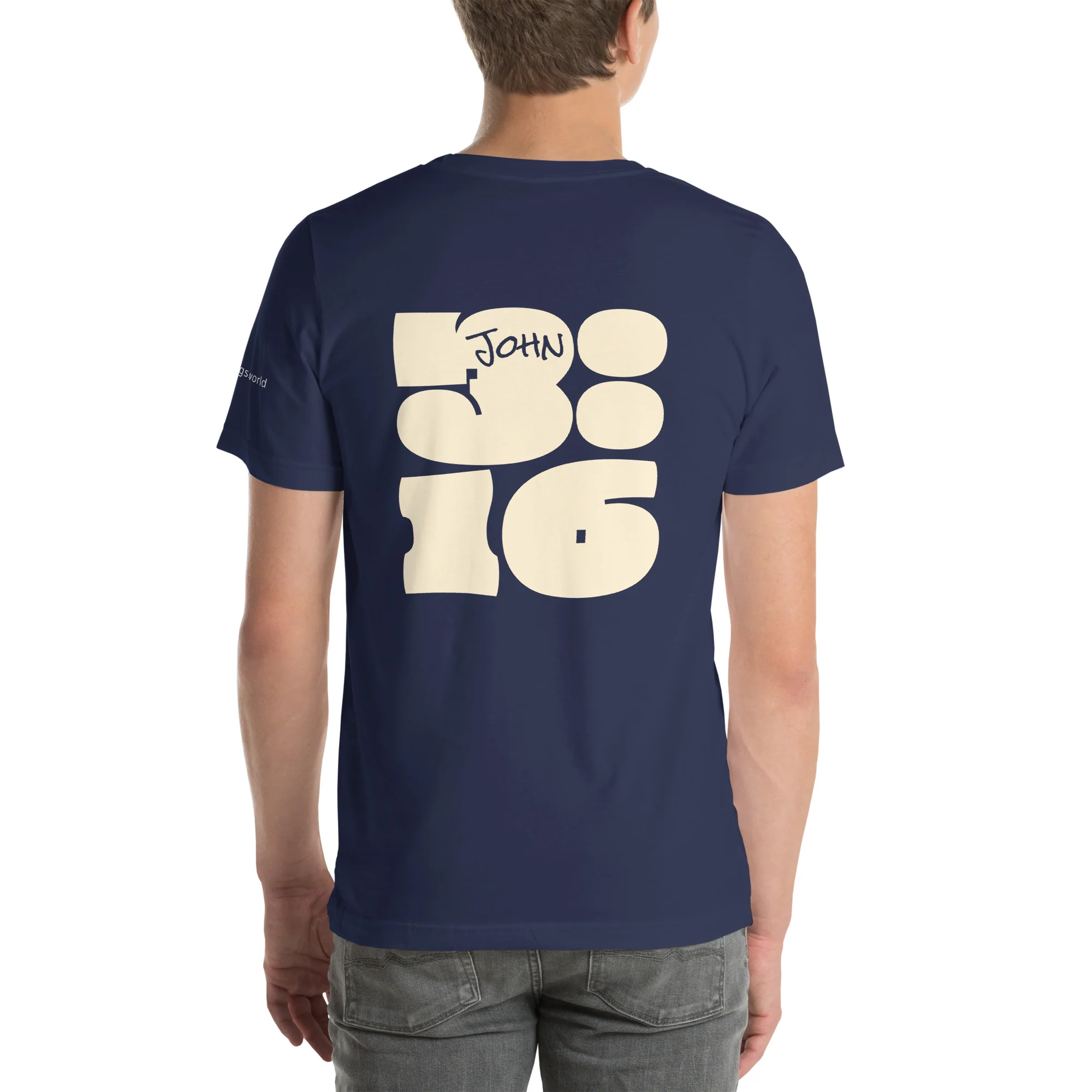
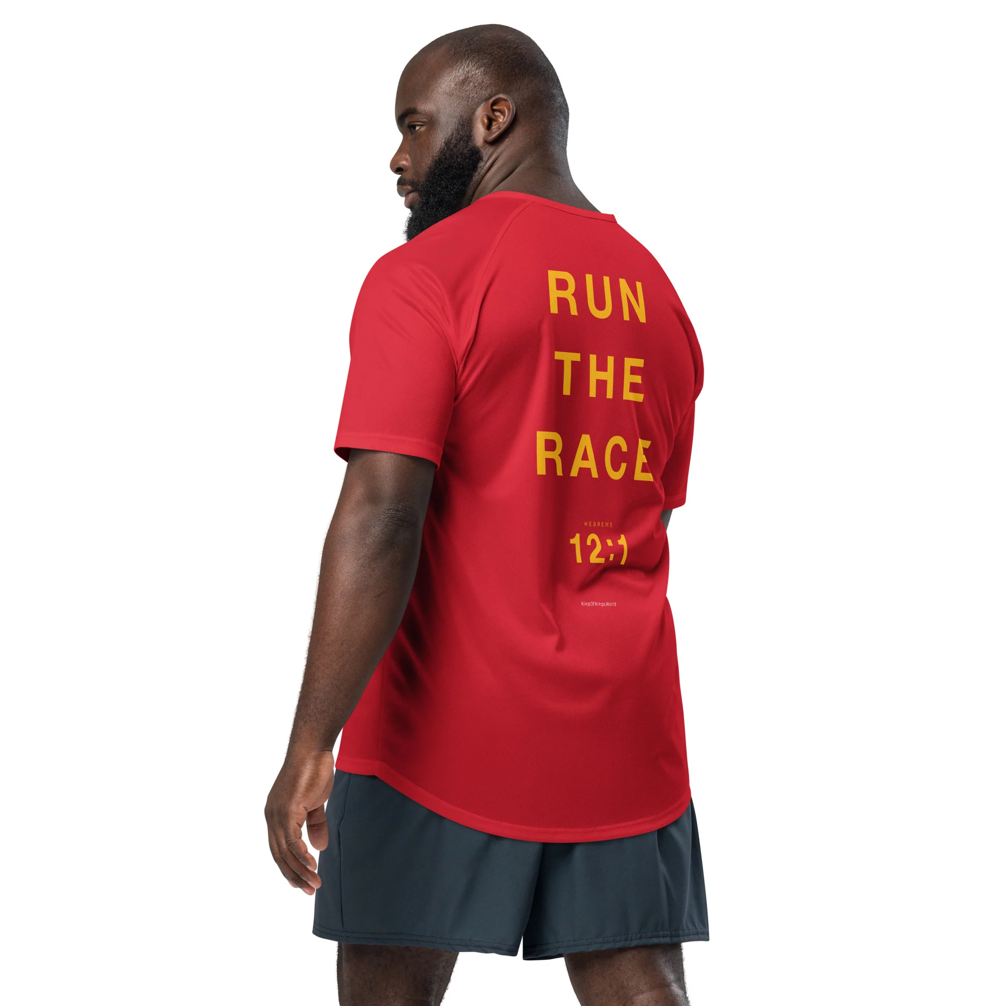
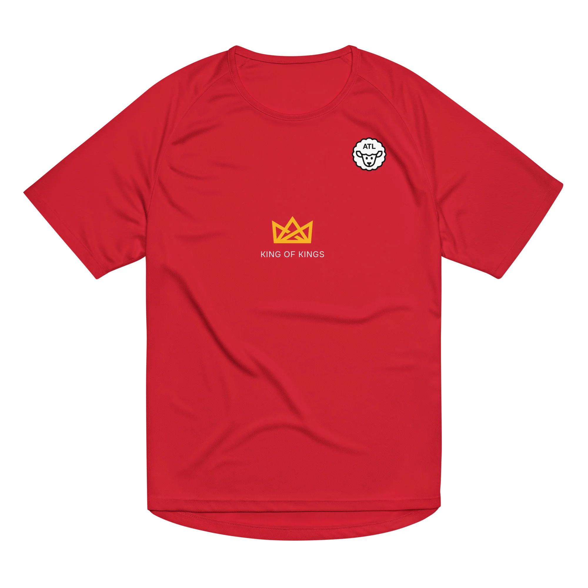
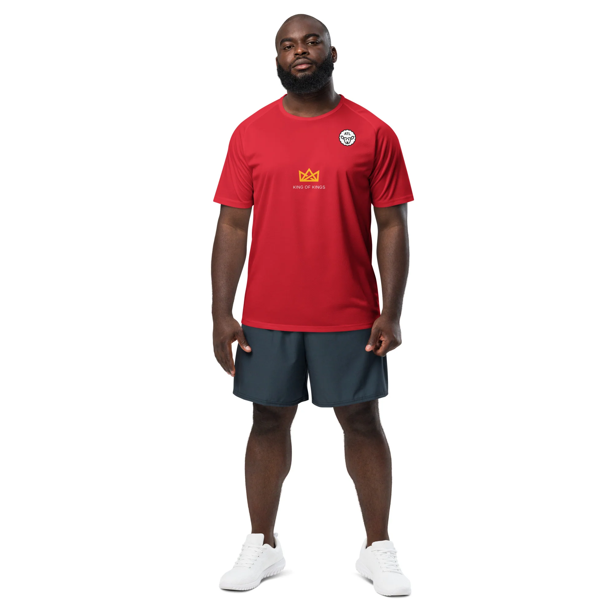
As King of Kings evolved, an observation from the running community revealed an unexpected opportunity. During long-distance races, runners spend considerable time looking at the backs of other runners' shirts.
What if that overlooked space could become an opportunity to inspire curiosity and conversation? This insight led to a dedicated running apparel collection.
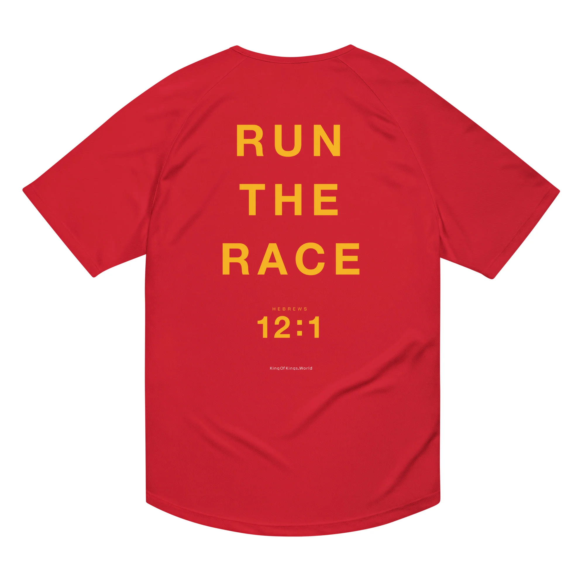
The design uses large, high-contrast typography to make the message visible from behind. The biblical reference is presented with oversized chapter and verse numbers, creating a visual resemblance to a timestamp — an unexpected treatment that invites curiosity about the meaning behind the numbers.
“Sometimes the most meaningful design opportunities come from observing how people experience the world.”
Run the Race — Hebrews 12:1
Digital experience
Bringing the brand to life online.
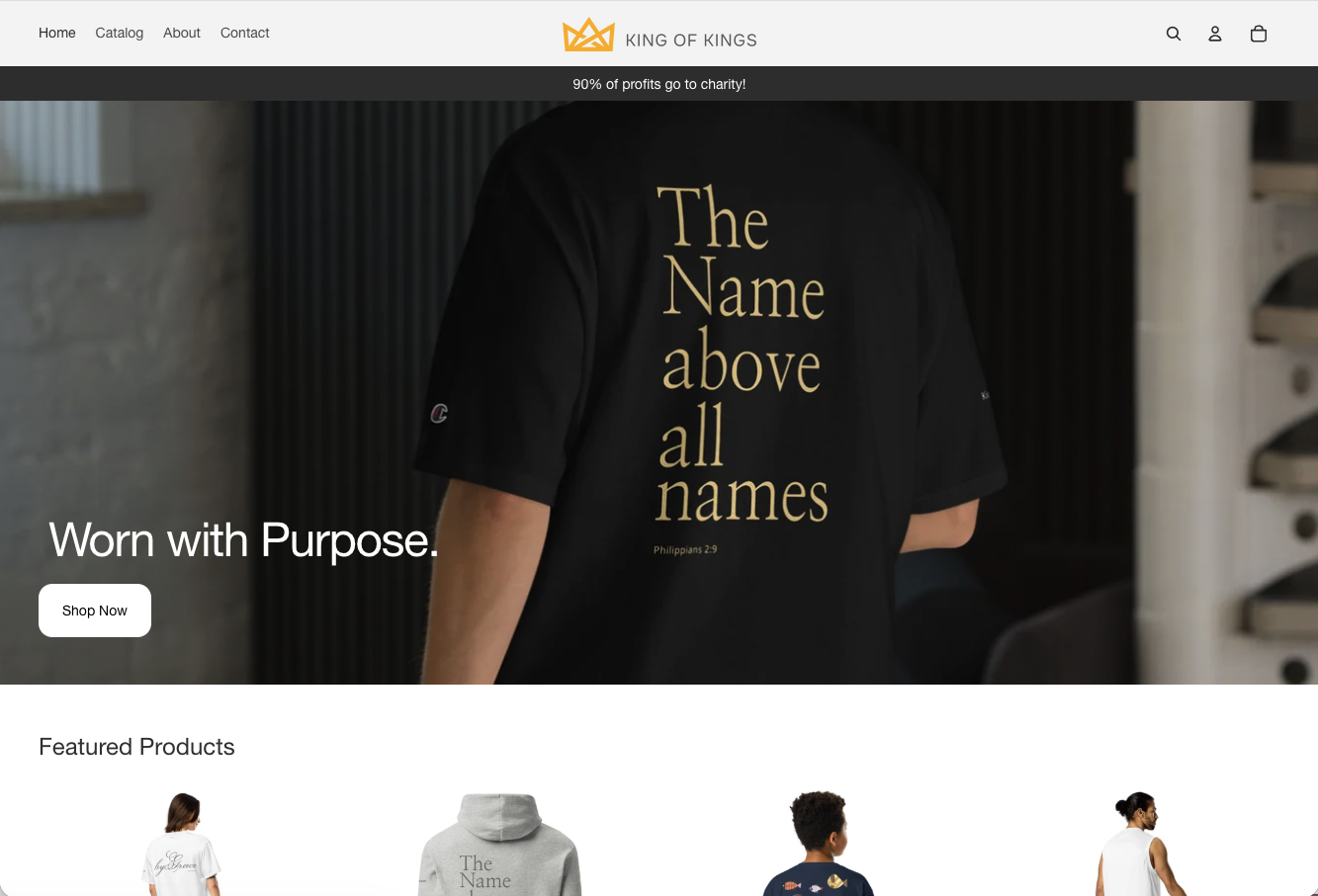
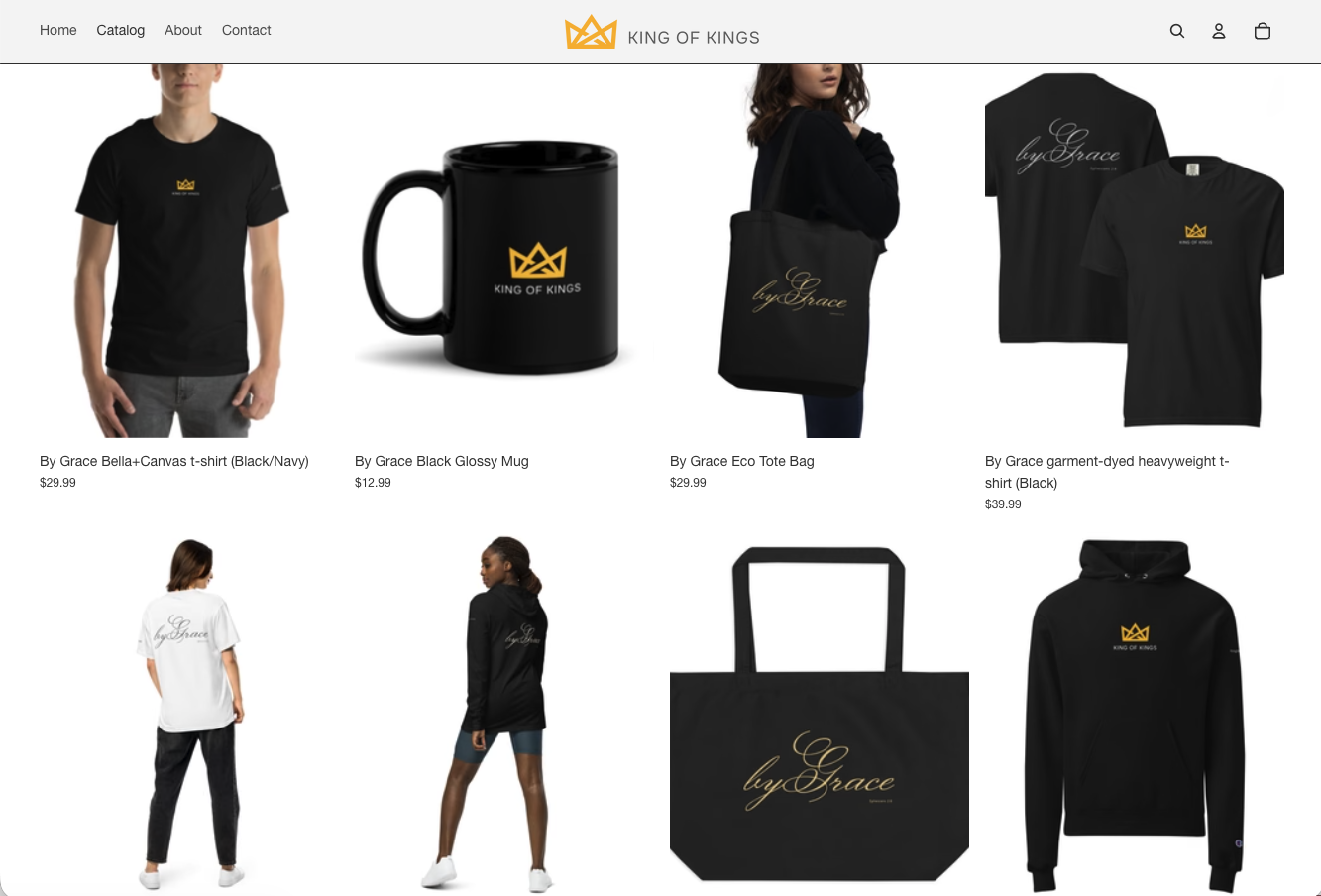
The King of Kings e-commerce experience was developed as an extension of the brand. From product presentation and typography to storytelling and navigation, the digital storefront was designed to create a cohesive experience from discovery to purchase.
Business model
Purpose beyond profit.
90%
Of profits committed to charitable giving
King of Kings was created with a mission that extends beyond the products themselves. The business commits 90% of profits to charitable giving, embedding its purpose directly into the business model.
This commitment reflects a belief that a brand's mission should influence not only what it communicates, but also how it operates.
Outcomes & scope
End-to-end
Brand strategy, identity, product design, and digital commerce developed as one coordinated experience
Brand expansion
An initial apparel collection evolved into new product concepts, including a running collection informed by real-world behavioral insights
90%
Of profits committed to charitable giving, embedding the mission into the business model
When purpose drives design.
King of Kings demonstrates how a clearly defined mission can guide strategic decisions across brand identity, product development, and digital experience. The result is a cohesive brand designed to create meaningful connections and evolve through new insights.
Want to bring your mission to life?